Scry
Role
UX Researcher and Designer
Background
Scry is a media streaming app that started as a free service. Following the roll-out of a paid subscription model, the app had to be redesigned to allow users to sign up for the premium service.

Research
But before I knew how to encourage users to upgrade, I needed to know what people would be willing to pay for. To that end, I created a questionnaire to get a sense of how consumers - particularly in Scry’s target demographic - interact with streaming apps.
Of the respondents I got, nearly all of them were already subscribed to Netflix and Amazon Prime, with Hulu a close second. As these are services with an abundance of content, I knew focusing on the specificity of Scry’s offerings was important to make the application a force in the market.
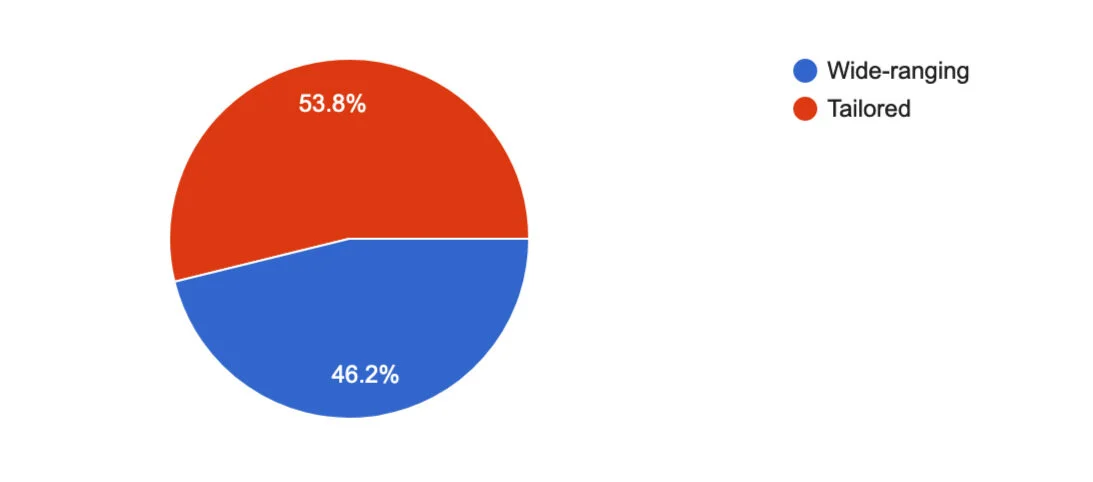
The choice to focus on a curated experience was supported by the survey as well: when asked if they would prefer an app that provided wide-ranging content or a tailored experience, the majority of users selected tailored.
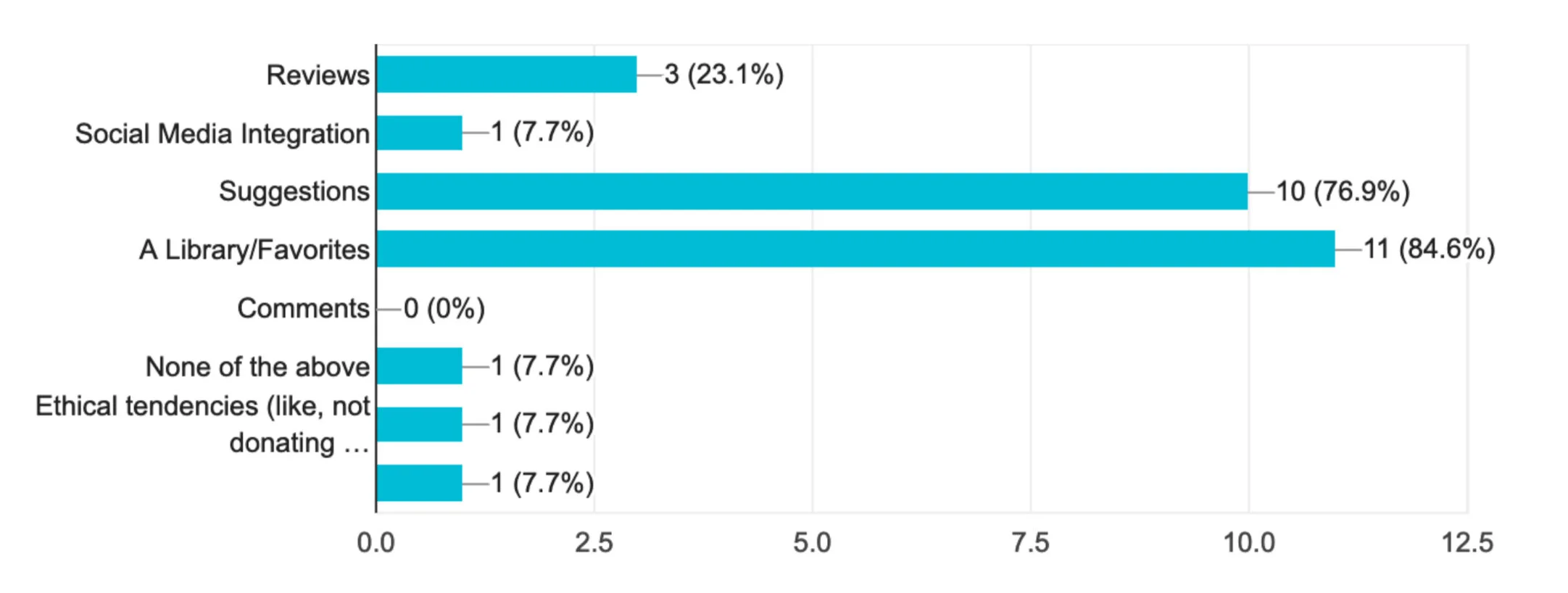
The next important information I learned was what features users look for in a streaming service. Far and away, the most popular responses were a library to save favorite content and suggestions for new content to view. I made a note to include those in the design, and used the other responses as possible additions if I found ways to include them.
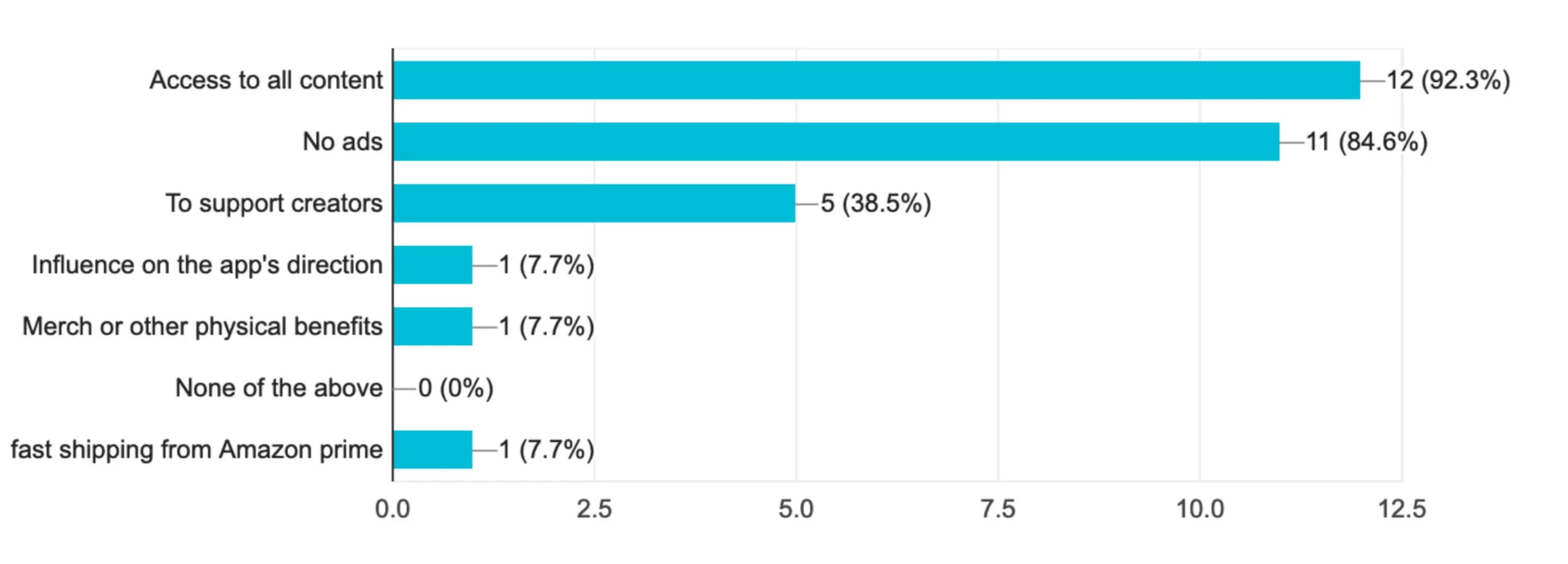
Finally, I needed to know what aspects encouraged users to actually take the plunge and spend money on subscribing to streaming services. The most popular answer was to have access to all of the service's content. Since Scry started out as a free application, I knew moving its content behind a paywall would have engendered a negative reaction in users. My solution to this was to have new content be temporarily exclusive to premium members before becoming available to everyone.
The close second most commonly chosen answer was to avoid ads in their viewing experience. I knew that this would be an easily-implemented solution in my redesign.
Persona
With this information in mind, I created a persona to reflect the typical user of Scry and their goals to help guide the rest of the project.

User Flows
With Paul and his goals in mind, I started the design process. First, per the stakeholders’ requests, I established the user flows for both new user account creation and returning users logging in, being sure to include the CTAs to upgrade from a free user to a paying subscriber.
Sketches and Low Fidelity
Using the flows to identify the key screens, I began to build the screens. I did some basic sketches on paper and then used them to design low fidelity screens in the Sketch application.

Prototyping and Testing
I put the screens together into a prototype using POP by Marvel. Using the prototype, I conducted five moderated usability tests. While the final goal of actually converting users to paid subscribers couldn’t be tested in this version, I focused on making sure users were able to navigate the application and find the ways to upgrade. Eliminating as many hurdles in the way of upgrading would make it more likely for users to subscribe in real life since, by and large, we’re a lazy species.
The tests gave me some great feedback on my design. Three of the more important insights I gleaned were:
Users were unsure where to go to upgrade when they logged in as returning users
Separating signing up for premium from enrolling in a free trial confused users
Users felt that they did not know enough about the application’s offerings to know whether upgrading was worth it
Testing, Round 2
I iterated on the high fidelity screens, taking care to include solutions to the issues revealed in testing. I then used POP again to make a prototype using those high fidelity screens and ran another five usability tests, with tasks that were the same as the first round..
This time around, the feedback given was more focused on aesthetic design decisions and I felt confident that I provided a smooth path for users to subscribe to Scry Premium.
Conclusion
Overall, Scry is ready for rolling out the premium option. At the very least, the design is in a place where users are informed about what subscribing entails and have multiple avenues to upgrade, should they so choose.
Going forward, as I mentioned earlier, the only way to judge wheter or not users will upgrade is to go live with the subscription plan and track conversions. But as of now, the app should meet the needs and wants of its target users in a way that would encourage subscribing.


